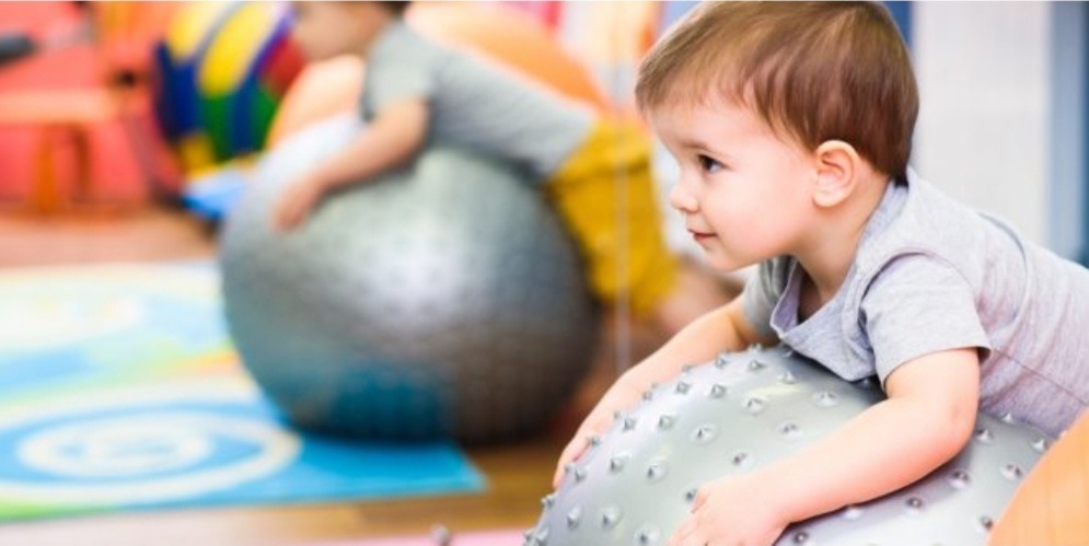
Unsere Kinder brauchen ein ganzheitliches Training, das ihre motorischen Fähigkeiten wie Koordination, Beweglichkeit, Gleichgewicht, Reaktion und Ausdauer verbessert. Das bedeutet,...
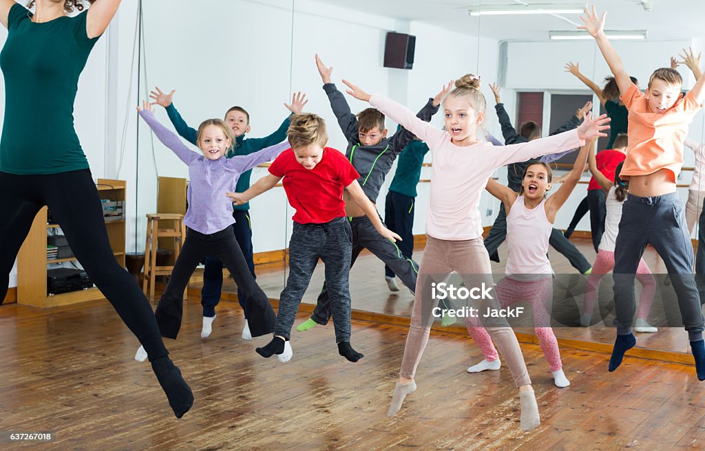
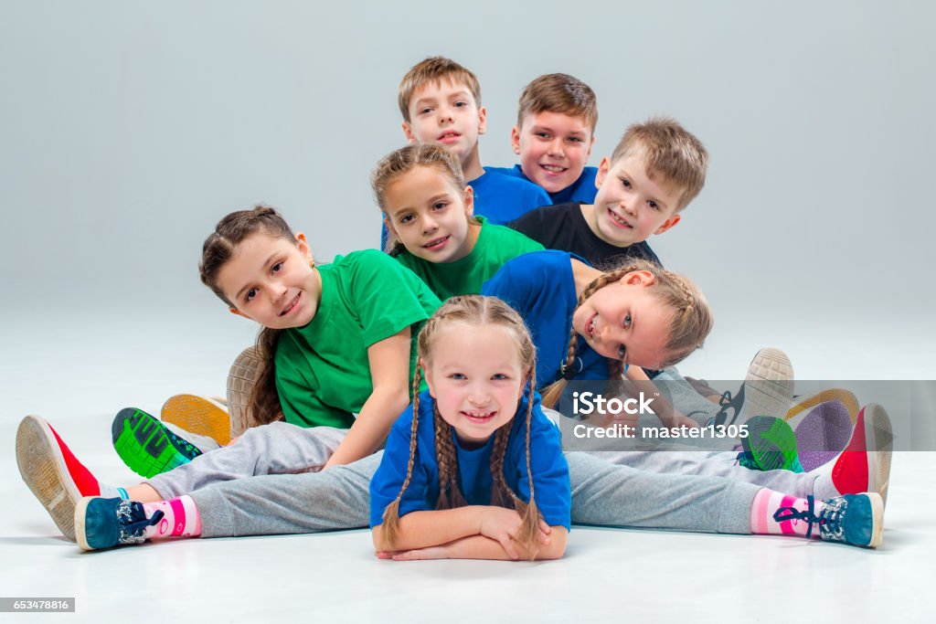
Hier erlernen die Kids die ersten Schritte der verschiedenen Tanzstile. Die Stärkung des Selbstbewusstseins, Teamfähigkeit und Koordination werden gefördert. Durch...
Wir vom EKIZ-Kematen möchten mit unserem Kursprogramm möglichst viele Familien erreichen und für Spiel, Spaß & Bewegung begeistern. Das Kursangebot umfasst alle Altersgruppen – von Säuglingen, die wenige Wochen alt sind, über Kinder im Volksschulalter bis zu Erwachsenen, die sich weiterbilden wollen. Somit sollte für alle Familienmitglieder etwas dabei sein. Auf Eure Anmeldungen freut sich das Team des EKIZ-Kematen.
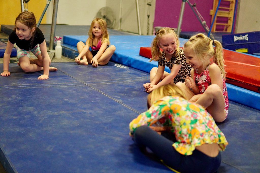
Hurra, ich versuch’s alleine! Selbstvertrauen und Selbstständigkeit werden gefördert. Bewegung, Spaß, Spiele und Freude stehen im Vordergrund. Der Schwerpunkt liegt...
Hier werden den jungen Tänzer*innen spielerisch und altersgerecht Tanzschritte aus den verschiedensten Tanzstilen vermittelt, es wird kindgerecht das Takt- und...
Hier erlernen die Kids die ersten Schritte der verschiedenen Tanzstile. Die Stärkung des Selbstbewusstseins, Teamfähigkeit und Koordination werden gefördert. Durch...